Have you been thinking of high-quality web design? Are you floundering with the things that you will put on your homepage? Are you second-guessing yourself?
If this is the case then you have come to the right place.
More often than not, experienced business owners and marketers struggle with nailing their homepage content.
However, it is safe to say that there is no perfect formula for this! As your website is your company’s virtual front door, you have the right to choose how to represent yourself.
In other words, there is an array of things that you can include on your homepage, but these 7 should be at the top of your list:
- Your business logo
On your
high-quality web design, it should always be placed on the top left corner. Do not get creative with placement as the left corner is a common hotspot for business logos.Also, your chosen logo should not include unnecessary visual elements. Instead, it should be placed in an outstanding way. The logo should be of a reasonable size. No matter how much you love your company, a billboard-sized logo to the center of your homepage does not increase the presentation it makes on your website visitors.
- The site menu
This makes the site menu the most important feature of your web page as it makes navigation easy. When creating your site menu, remember to be as descriptive as can be. Sections like ‘services’ and ‘about us’ among others will optimize your website in the best way.
- A clear hero shot
It is the main image. Ensure to blend this image tastefully to your
high-quality web design. Additionally, it should perform the gatekeeper role by combining verbal and visual elements of the page.Most importantly, this image should be simple, focused and easy to understand. For instance, if you run a pizzeria, a picture of a whole pizza and an order line defines what you do and sends the right message.
- A suiting headline
Usually, the headline appears above or below the hero shot.
Needless to say, you should choose a headline that gets the job done. It should be clear and serve the reader. If you are not confident with your writing chops, a professional copywriter can always come up with the perfect headline for your website.
- Your business portfolio
Imagine your visitors reading about your architecture services and somehow trying to picture what you do.
Then imagine them reading about your architecture services and actually seeing what you do. Isn’t the latter more powerful? As such, your homepage should include a portfolio that clearly showcases your products, services, and even customer testimonials.
- A blog
By directing the website visitors who are cruising around your homepage to your blog, you will increase user engagement and score more leads. As someone once said, ‘content is king.’
- A can’t-miss call to action
For an effective call to action, it is best, to begin with, action words that do not start with ‘click’.
For instance, instead of ‘click here for web design focused results’, you can opt for ‘Want web design focused results? Follow this link.’ Remember, the size, color and placement of your call to action will directly affect the rate of conversion.
There you go! 7 things that will complement your high-quality web design! While your homepage can feature whatever you want, it is best to gear it towards your visitors’ needs.
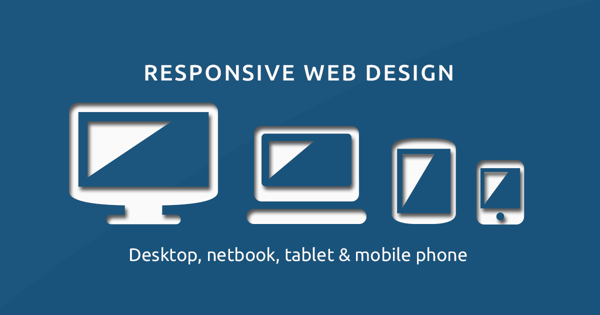
Most importantly, do not forget to optimize your website for mobile. When your homepage is mobile-friendly, then you will win a whole lead of people who prefer to surf using their mobile phones.
Does your website's homepage have all or most of these elements?


