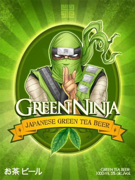
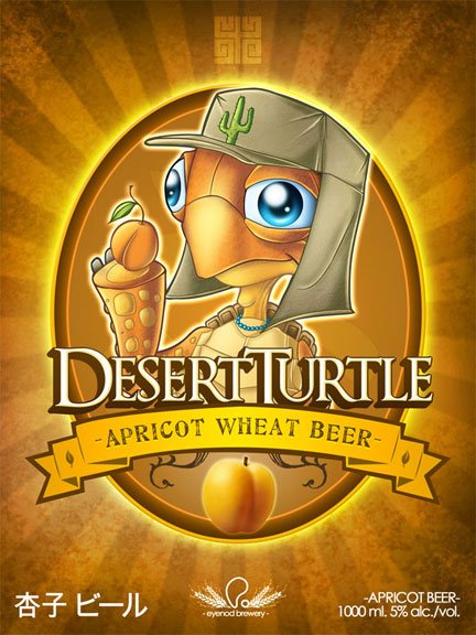
Hello Everyone here we have a design/illustration tutorial. We are working on a label for a Micro brew beer.

Step 1
First of all, I will go through all the process and how I came up with a rough sketch of what my character would look like.
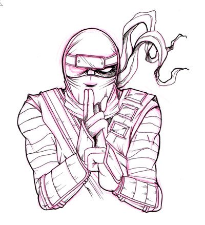
Here is a sketch on paper with a permanent marker line art. Scan your work and keep the file on a 300dpi resolution. The bigger the better, that way scaling down works best! The sketch was done on red so we could easily separate the line art from the sketch. How? Super easy! At first label your layer by double clicking on it.
Step 2
You can either do it by ctrl+click on PC or command+click on MAC and select your sketch layer, once you have the marching ants you go to the channels tab and click on your red channel.
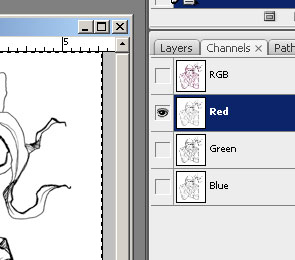
You copy that channel layer ctrl+c on PC command+c on MAC. And you click again on you composite channel (RGB) to select them all. You go back to your layers panel and paste your red channel as a layer ctrl+v on PC or command+v on MAC. Name your new layer LINE ART.
Step 3
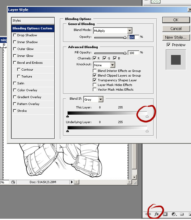
Let’s go to the levels adjustment ctrl+L on PC or command+l o MAC and tweak your sliders so you get a clean black and white image. Try and get all the grays out. Easy! Now to get rid of the white and keep a clean lien art! OK so we can get rid of that first sketch of ours or keep it if you like to have the history. I personally like to have all my layers at the end and see how much the image changed from beginning to end. (I know many of your might be dying about the left eye of the ninja but I’m getting there!) Ok, now we get rid of the white background. Hide all your layers but your line art by doing alt+click on PC or optn+click on MAC over the little eye icon on your layer. We open the blending options of our LINE ART layer by double clicking on the space next to the name or by simply going to your “FX” button.
After that, selecting blending options. There you’ll have 3 blocks and the third one is the one we want: “Blend If: Gray” Here you want to slide the white triangle to the left until the white is totally gone! Click OK when done.
Step 4
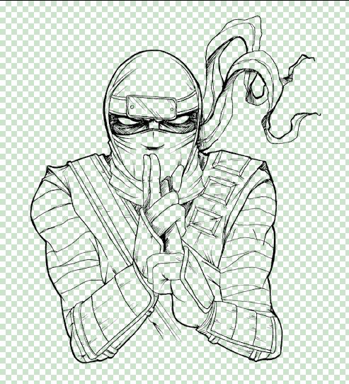
Great! Now we need to lock those changes so we need to press ctrl+click on PC or command+click on MAC on the create new layer icon so that the new layer appears under our line art layer. Then select both and press ctrl+e on PC or command+e on MAC to merge both layers onto one and keep it in transparency. Awesome! Now we can finally duplicate that eye and get ready to color it.
Step 5
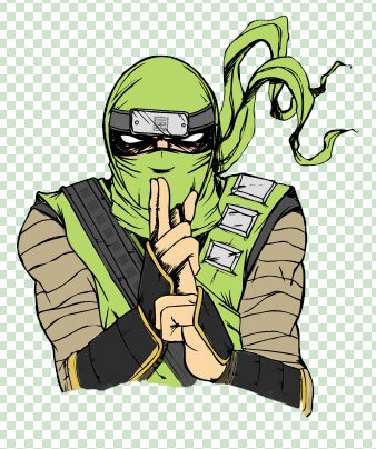
Once OK, we can go to the painting process. Create a new layer under the line art and layout all your flat colors.
Step 6
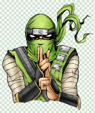
it is time to work on your lights and shadows. Use brighter tones of the same layout colors for the highlights and darker for your shadows. Once you finish, you should have something like this:
Step 7
Now we can take this great drawing to the next level. We are going to color the line art. What? my precious clean clack lines? yes! to do this you want to lock the transparency on the line art by clicking on this icon:
Now it is coloring time. Choose the darkest color of the shadow per section of your character. Let’s say you are working on the hoodie of the ninja. Select your darkest value with the eyedropper tool and go a little darker than that. Why? just so that the line art doesn’t blend with the shadows. Once you have that color start brushing in! Your final illustration would look a little like this:

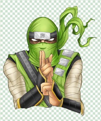
Step 8
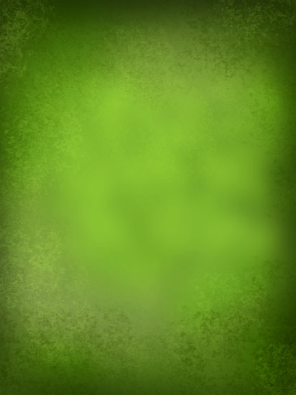
Since you have done with the character. It is time to work on the label. Setup your size and resolution on a new document. Remember 300+dpi is best if you want to print. Firstly, we set the background color in green. Press alt+backspace on PC or option+backspace on MAC to fill the layer with your choice of color.
Step 9
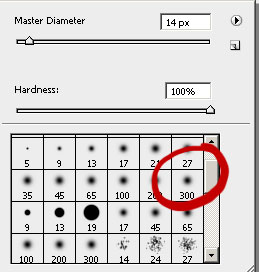
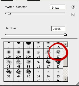
With a soft brush ,the dodge and the burn tool you need to work out some shadows and lights. Then choose greens with the same dodge and burn but with a textured brush as below.
Step 10
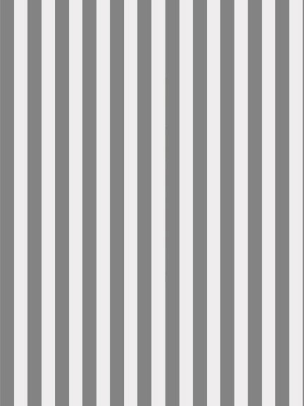
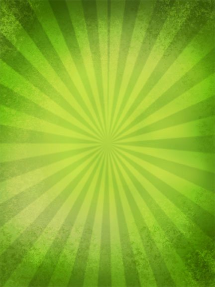
Now we go to work on the starburst effect. Create a new layer; and then,draw line and dark gray rectangles like this:
Step 11
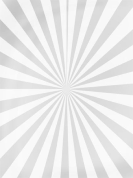
Go to the main menu and select “Filters” then “Distort” and lastly “Polar Coordinates” and use RECTANGULAR TO POLAR. BAM! Starburst. Now lower the opacity to about 50% and change the blend mode to “Overlay”.
Step 12
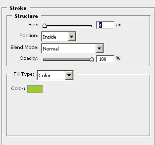
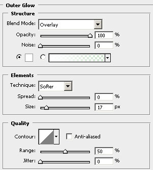
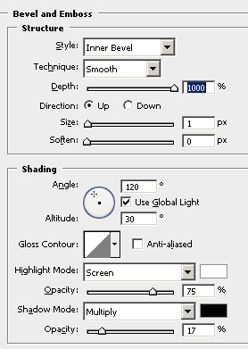
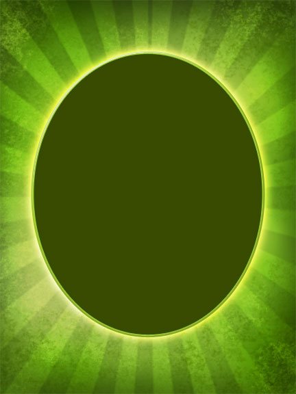
It’s time for the Ovals. Firstly, we create our oval in a dark green. And then apply the following layer styles and apply the following settings as below:
Step 13
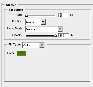
We duplicate the layer by pressing ctrl+j on PC or command+j on MAC. Then change the color to a darker green and adjust the stroke settings to:
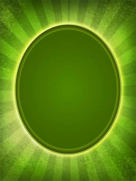
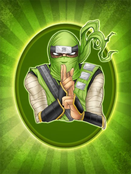
And then, add your illustration layer
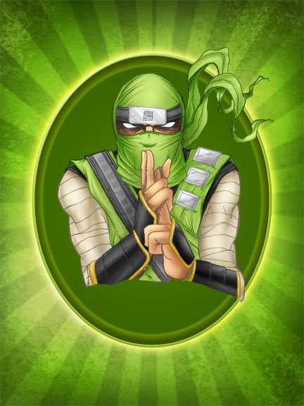
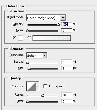
Apply the following outer glow layer style to make it POP:
Step 14
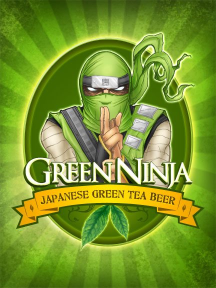
And then, we can add logo, flavor and text into the recipe!
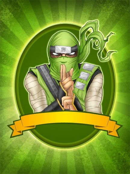
Use the same idea to create the template as this:
